Box User Management Experience
Project overview
IT admins of an organization use the user management tool to manage Box accounts for their employees, their permissions and settings. This tool had grown out-dated over the last 6 years and no longer effectively supported the needs of the Admins.
I was responsible for understanding the current user pain points and reimagine the experience to improve performance and usability.
My role
Lead designer— discovery, user research, ideation and design, prototyping, usability testing.
Team
1 Designer, 1 Product manager, 5 engineers.
Box provides cloud content management solutions to its customers to securely store, manage, and share their content with users inside and outside their organization.
Box has 2 main facets– the consumer app and the admin app.

Box consumer app
This is a customer facing app which users use to store and manage their files within box.
Box Admin console
Admin app gives IT admins comprehensive IT controls that lets them manage (add, edit, delete), configure the right settings and permissions for users in their company and run audit reports.
I, along with 2 designers own the responsibility of the design of the Admin console. In this project, I led the redesign of the User Management tool of the Admin console.
User Management tool
This tool is the primary place for Admins to add, edit, remove and set up users with the right permissions and features within the company.
The current user management tool was built 6 years ago with constant features being added to it. There were band-aid fixes made to issues identified over time but the number of issues and the tech debt had reached critical mass that we decided that both the backend architecture and user experience needed a complete overhaul.
Scale–As the size of our customers grew, our User Management system failed to scale proportionately with them. For the top ~10% of our largest customers the User Management experience had become near unusable– on average, pages took 10-60 seconds to load.
Usability– Over the years as additional features got added, the user journeys had become increasingly complex and convoluted. In Q3 2019, 29% (94 of 321) of admin tickets raised were "how-to" tickets for features which already existed on the platform, but because of usability issues were either unusable or undiscoverable by admins.
We have a few channels to gather customer feedback, which product and design utilize to identify key problem areas and product opportunities.
“ The slowness of the Admin Console materially impacts our use of Box and prevents us from being able to work through our day to day ” –IBM
“ The admin tools look like they’re from the 90s...it’s not intuitive ”
–Lazard
Box Admin has 5 key personas defined that we design for ranging from IT Admin, Legal, Security admins, Group Admins and Helpdesk agents. The user management tool is used primarily by one persona– IT Admin.
Talking to IT Admins for this project, I identified 3 sub-personas that showcased distinct and specific goals and needs.
.png)
Goal of the entire project was 4 fold–
I referenced and identified the Box personas who use this tool and their key user journeys, cross-referencing them with the insights from our research to narrow down and fix the broken journeys.

Cross reference user tickets and complaints with key user journeys.

Arrive at preliminary list of usability issues.

Reference logs to measure frequency of each action.

Survey admins for respective criticality of each journey.

Arrive at a shortlist of features mapped to key user journeys.

In the existing experience, the users can view and edit information on the same page. From data we discovered that 60% of the time admins are viewing information and only 20% of the time they use the tool to actually edit user information.
Using this insight, I created two separate modes– View and Edit.

View mode– Provides Admins with a cleaner UI where they can easily scan information without being overloaded with functionality. More importantly they don't need to worry about accidentally updating any user information.
Edit mode–A dedicated edit mode for times when Admins need to update information.


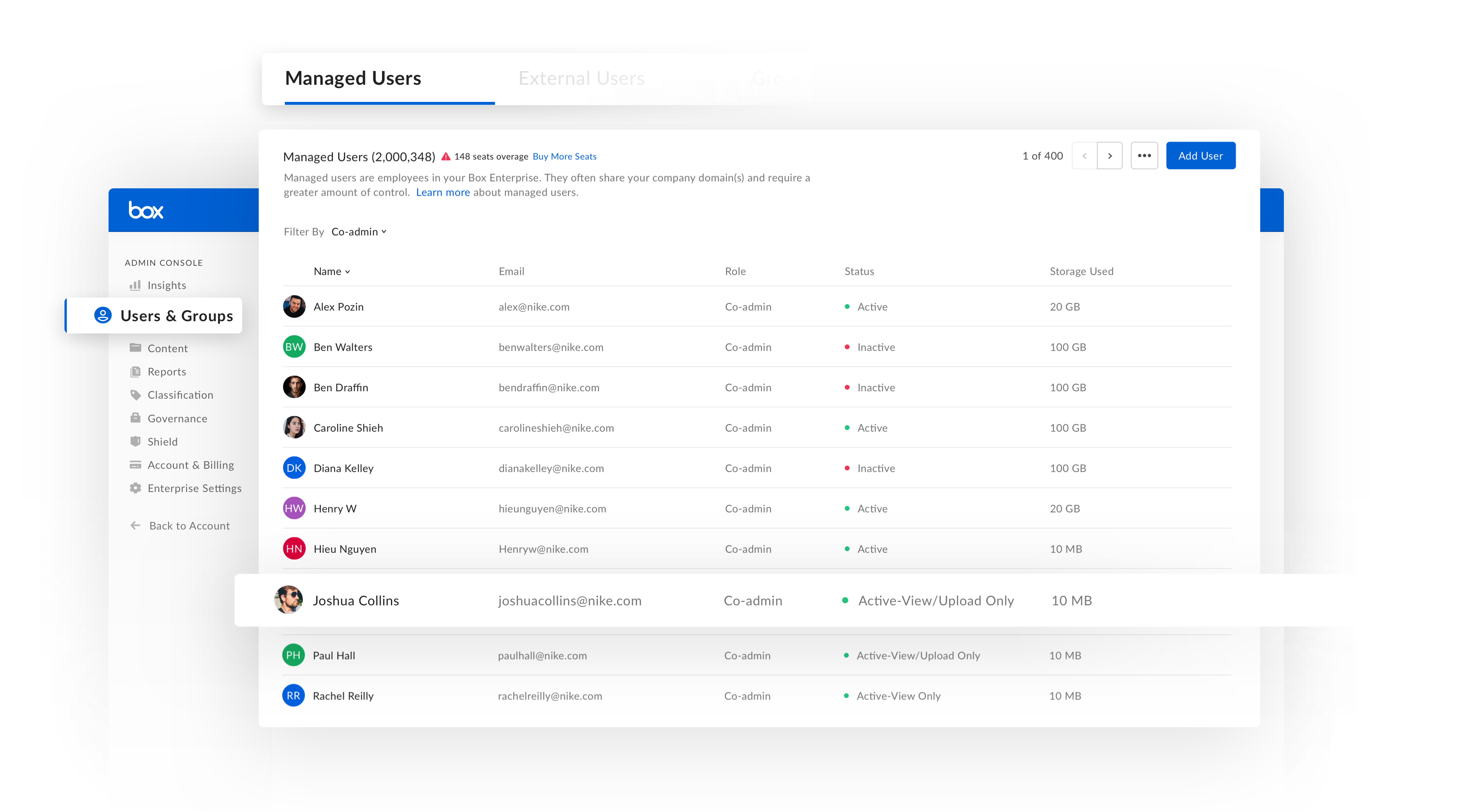
Before— The stacked view of info was not easily scannable, and information hard to parse. Some important information that admins would like was missing. Other attributes were either not useful or misleading.

After— In the new dashboard, I updated the UI using Box design system and patterns. Reprioritized the attributes to be shown based on user input and usage analytics..
Before— The stacked view of info was not easily scannable, and information hard to parse. Some important information that admins would like was missing. Other attributes were either not useful or misleading.
After— In the new dashboard, I updated the UI using Box design system and patterns. Reprioritized the attributes to be shown based on user input and usage analytics..


The existing sort and filter functionality was the least discoverable and most problematic feature that came up in user study. Sort and filter were jumbled in one, and the “Filter by groups” section listed all the groups in the enterprise (which for a typical enterprise ran in 1000s), rendering it unusable.
I used the table component making it easier to scan and compare information across all users.
I questioned the existing information shown in list, and prioritized contextual/actionable information. Also bubbled up new data fields in the table based on admin feedback.
I added visual indicator for user status, so using color and label it’s easy to parse important information.


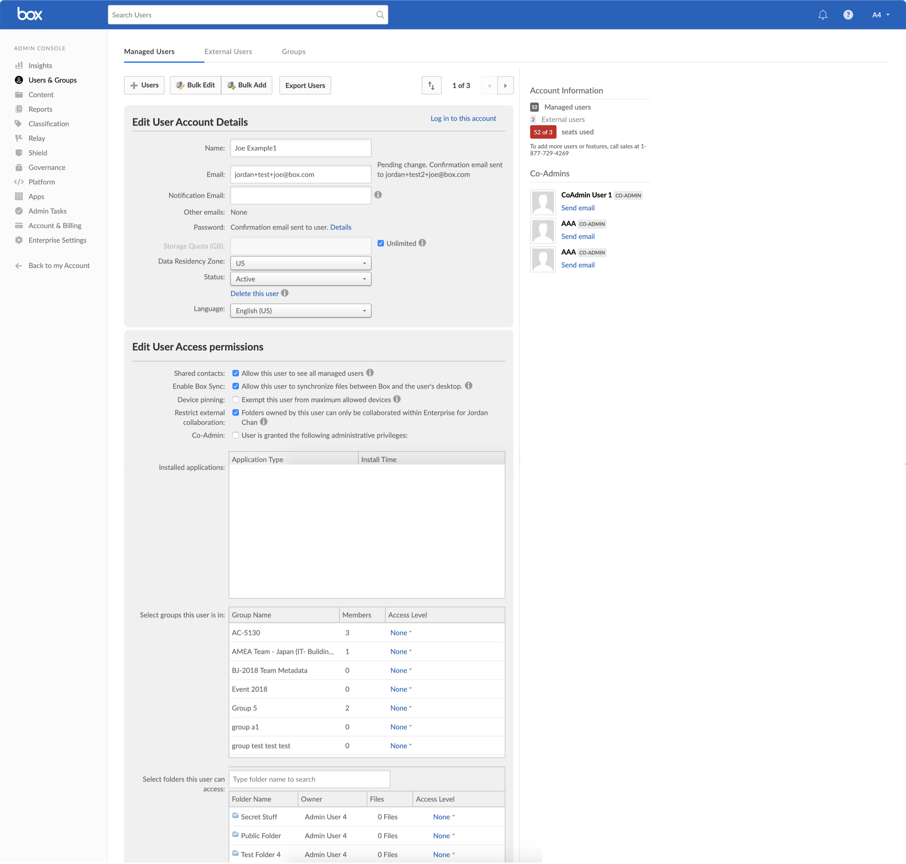
Before— Admins today see this one long page which is a giant wall of information, permissions and settings making it really hard to scan useful information and increasing cognitive overload.
.png)
After— In the new experience, all the information and permissions for a user is chunked appropriately into different card modules. These cards can be expanded and collapsed on demand making it easier to parse information and reduce scrolling.
Before— Admins today see this one long page which is a giant wall of information, permissions and settings making it really hard to scan useful information and increasing cognitive overload.
After— In the new experience, all the information and permissions for a user is chunked appropriately into different card modules. These cards can be expanded and collapsed on demand making it easier to parse information and reduce scrolling.


Before— The co-admin setting is a critical setting which is rather buried, bunched together with member settings, making it hardly visible.

After— In the new UI, there’s a dedicated user attribute to highlight the user’s role– member, co-admin or admin.
The permissions show under separate headers making it easier to differentiate between co-admin and member permissions.
Before— The co-admin setting is a critical setting which is rather buried, bunched together with member settings, making it hardly visible.
After— In the new UI, there’s a dedicated user attribute to highlight the user’s role– member, co-admin or admin.
The permissions show under separate headers making it easier to differentiate between co-admin and member permissions.
Before— The group view shows the entire list of groups in the enterprise (1000s) and the only way to view the groups a user belongs to is to scroll through all of them, with no way to search a particular one.
Group names get cut-off after 30 characters, making it impossible to view long group names at a glance.
After— We only show the groups a user belongs to. Admins can filter or sort by group name, or sort by access level for quicker access.
There is a full page edit mode where all the permissions are explained in-line making it easier to discover and understand intuitively.
Before— The group view shows the entire list of groups in the enterprise (1000s) and the only way to view the groups a user belongs to is to scroll through all of them, with no way to search a particular one.
Group names get cut-off after 30 characters, making it impossible to view long group names at a glance.
After— We only show the groups a user belongs to. Admins can filter or sort by group name, or sort by access level for quicker access.
Wider column for group name to show longer names of groups by default. For even longer names, a tooltip is used to show the complete name.

Before— The existing UI showed the entire list of folders (10s of thousands) in the enterprise which made it very difficult to see folders specific to a user.
Folder names would get cut-off after 30 characters, making it impossible to view long folder names at a glance.

After— We only show the folders a user belongs to. Admins can filter or sort by folder name, or sort by access level for quicker access.
Wider column for folder name to show longer names of folders by default. For even longer names, a tooltip is used to show the complete name.
Before— The existing UI showed the entire list of folders (10s of thousands) in the enterprise which made it very difficult to see folders specific to a user.
Folder names would get cut-off after 30 characters, making it impossible to view long folder names at a glance.
After— We only show the folders a user belongs to. Admins can filter or sort by folder name, or sort by access level for quicker access.
Wider column for folder name to show longer names of folders by default. For even longer names, a tooltip is used to show the complete name.

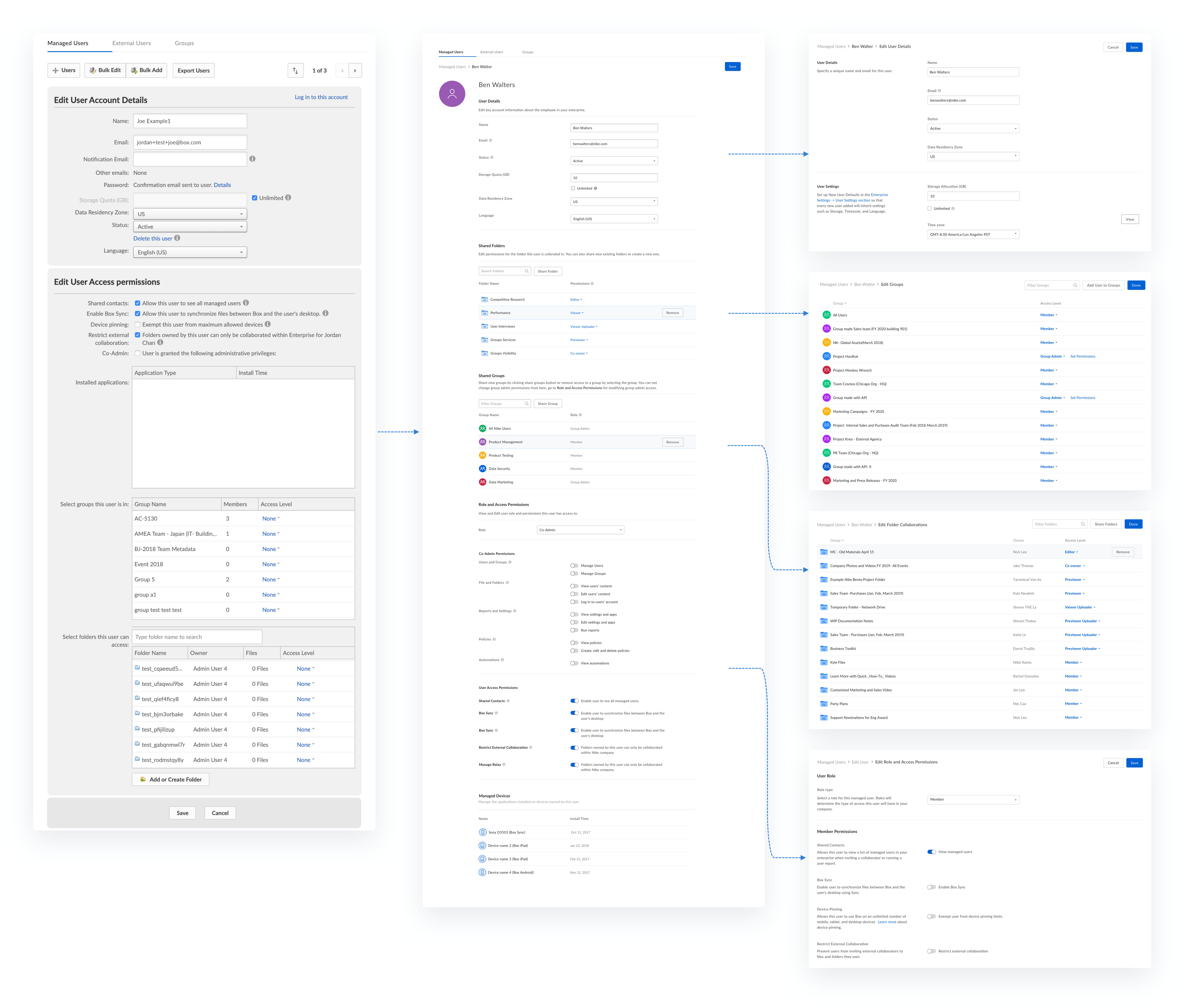

Before— In this UI, admins have to scroll a long list of groups till they find the group they were looking for to add user to the group or update membership.
After— In the new UI, admins can click on edit button to access a full page edit model where user can the list of groups user is a member of. They can find filter groups for a user, add user to other groups by clicking add button or modify memberships inline from the dropdown.
Before— The co-admin setting is a critical setting which is rather buried, bunched together with member settings, making it hardly visible.
After— In the new UI, there’s a dedicated user attribute to highlight the user’s role– member, co-admin or admin.
The permissions show under separate headers making it easier to differentiate between co-admin and member permissions.
Before— Co-admin permissions are an important set of settings which were hidden behind a checkbox making it really hard to discover (specially for new admins).
All these permissions are difficult to understand, all the additional information is hidden behind a tooltip, which is hard to interact with.
After— In the new UI, The permissions show under separate headers making it easier to differentiate between co-admin and member permissions.
There is a full page edit mode where all the permissions are explained in-line making it easier to discover and understand intuitively.
Before— One of the most significant problems I noticed in the existing UI was with the save experience. The save button was barely discoverable because it’s a really long page and the CTA merges with rest of the information due to the lack of visual hierarchy.
The apparent lack of discoverability of the CTA perpetuated the belief that the system auto-saves user changes. Not only was this not true, but the system also never warned when the user navigated to a different section of the app without saving. Often Admins would lose their changes without ever realizing their changes were never saved.

After— In the new UI, edit mode had a clear save button on every page.
Wider column for group name to show longer names of groups by default. For even longer names, a tooltip is used to show the complete name.
Also if the user happens to navigate to a different section of the app without saving, the system warns the user and gives them a chance to save.
Before— One of the most significant problems I noticed in the existing UI was with the save experience. The save button was barely discoverable because it’s a really long page and the CTA merges with rest of the information due to the lack of visual hierarchy.
The apparent lack of discoverability of the CTA perpetuated the belief that the system auto-saves user changes. Not only was this not true, but the system also never warned when the user navigated to a different section of the app without saving. Often Admins would lose their changes without ever realizing their changes were never saved.
After— In the new UI, edit mode had a clear save button on every page.
Also if the user happens to navigate to a different section of the app without saving, the system warns the user and gives them a chance to save.
Bring page load time below 5 sec
The managed users page for all enterprises- small or large should load under 5 seconds making the page responsive and seamless.
Improved Usability of the page should increase usage of key actions
Improved user management experience should increase the number of meaningful actions taken after the re-design. Usage of key actions must not decrease.
Reduction in customer support tickets
Improved in-product documentation and usability of managed users page should reduce the number of support tickets customer success team receives from customers around user management.
This project was a major ground up redesign involving a lot of user research, usability testing and UX compromises all throughout. As much as I would have liked that the new user management tool would have launched timely but shifting priorities and engineering resource constraints have pushed the timeline to an April launch.
When increasing the number of clicks is a good thing
By choosing to create separate view and edit mode meant increasing the number of clicks for our admins. Even though the clicks increased, the experience made admins more confident on their decisions by fully understanding what different permissions and settings mean.
Admins don’t change settings everyday, and also the given the criticality of the actions, the goal of the project was to help admins take the right decision, rather than the fastest decision necessarily.
Prioritizing features
This was a major redesign project where we had to re-build the entire tool, both from backend and front end perspective. We uncovered a lot of usability pain points, new features from user research and also logs data. It was a great learning to go broad to learn everything, and then prioritizing the most impactful areas to focus on first.
.png)
.png)