Green Chef's Order Management - Reimagined

Project overview
GreenChef is a meal kit delivery service where customers can order a box of their favorite meals on a weekly basis. Previously users had to skip the order if they didn’t like their meals for the week or were out of town. The new account management features solve for these problems by allowing easy planning, scheduling, and delivery options.
My role
Lead designer— user research, wireframes, user flows, prototypes, visual design and usability testing.
Team
1 Designer, 2 Product manager, 3 engineers, 1 Content writer.
Meal kit delivery services like Green Chef are subscription-based services that send customers pre-measured and pre-prepped ingredients, sauces and a step-by-step recipe card for them to follow and prepare fresh meals. Customers can choose from a wide variety of meal plans and get a box delivered right to their doorstep. This saves customers from the weekly hassle of grocery shopping and meal planning.

The goal of the project was to understand the primary reason behind a customer skipping an order and to design features that solve customer needs and effectively increase ship rate.
Unlike other popular subscription-based services like Netflix or Spotify - where users are generally on autopilot subscribed mode - Green Chef users take a weekly/fortnightly decision to order or skip a box from GreenChef based on various factors. Skipped weeks mean reduced ship rate and lost business for Green Chef.
We did 30+ customer calls, partnered with the customer support team to study customer tickets and sent out user surveys to understand the challenges our customers face and primary reasons to skip.
I worked with the product manager to conduct these customer calls by creating interview scripts, taking notes and helped synthesize the qualitative data to identify customer pain-points and opportunities.
Five key areas emerged.
Changing meal preference
One of the biggest reasons that people skip a week is due to them not liking a particular week’s recipes.
"I don’t like salmon/potato. I usually skip the week you’ve salmon or potato in your recipes."
Changing delivery days
'Change delivery day for one week’ showed up in 26.6K customer service tickets.
“My meals are scheduled for delivery on Wednesdays. Is it possible to reschedule one week to a Thursday or Friday?”
Changing delivery address
'Change Address for one week’ showed up in almost 10K customer service tickets.
"My house is going to get tented for a few days starting tomorrow (Wed). I would really appreciate if I could change the address for delivery for this week (Friday) to xxxxxxx"
Changing box quantity
"Is it possible to get two boxes for this week or am I too late? My parents are coming to town."
"We are having company next week and I would like to change the order to 2 boxes for that day only, then return to my 1 box order. I don't seem to be able to do that ... can you assist?"
Non- subscription orders
"I want 2 boxes every week - 1 PALEO and 1 VEGAN. How do I do this?"
"I want to get 2 boxes delivered to the same house. How do I add another order?"
To summarize, users need the flexibility to modify their orders. The original design didn’t allow a one-time change in menu, the only way to achieve that was by changing the meal plan at subscription level which impacted the orders for every subsequent week.
Limited flexibility during planning and scheduling phase forced people to skip weeks, cancel the subscription or bounce around to a different meal kit service.
To get the collective knowledge and understanding of the group, I got product, engineering, and design into a room for half a day. We established the user needs, business needs, constraints and assumptions to define the scope of the project. The team shared initial ideas and drew some concept whiteboard sketches.


User needs
Business needs
Constraints
Assumptions
It became evident that with no flexibility, users skip. There was a need to enable users to edit/modify different aspects of their weekly orders.

Original order journey
Each week only if all factors are suitable, the user will place an order. Even if a single factor fails, the user will skip.

Proposed journey with Modify order
Add the option to modify different aspects or the order.
Sketching the interface
During the initial design phase, I follow the process of sketching out low fidelity ideas on paper. It helps me to bounce off many ideas with the product team before getting too deep into one solution.


Wireframe iterations
I then created wireframes based on the initial feedback and worked on a more detailed vision of the solution.

Existing account's page
The original design didn’t allow changing menu for a week, the only way to achieve that is by changing the meal plan at subscription level.

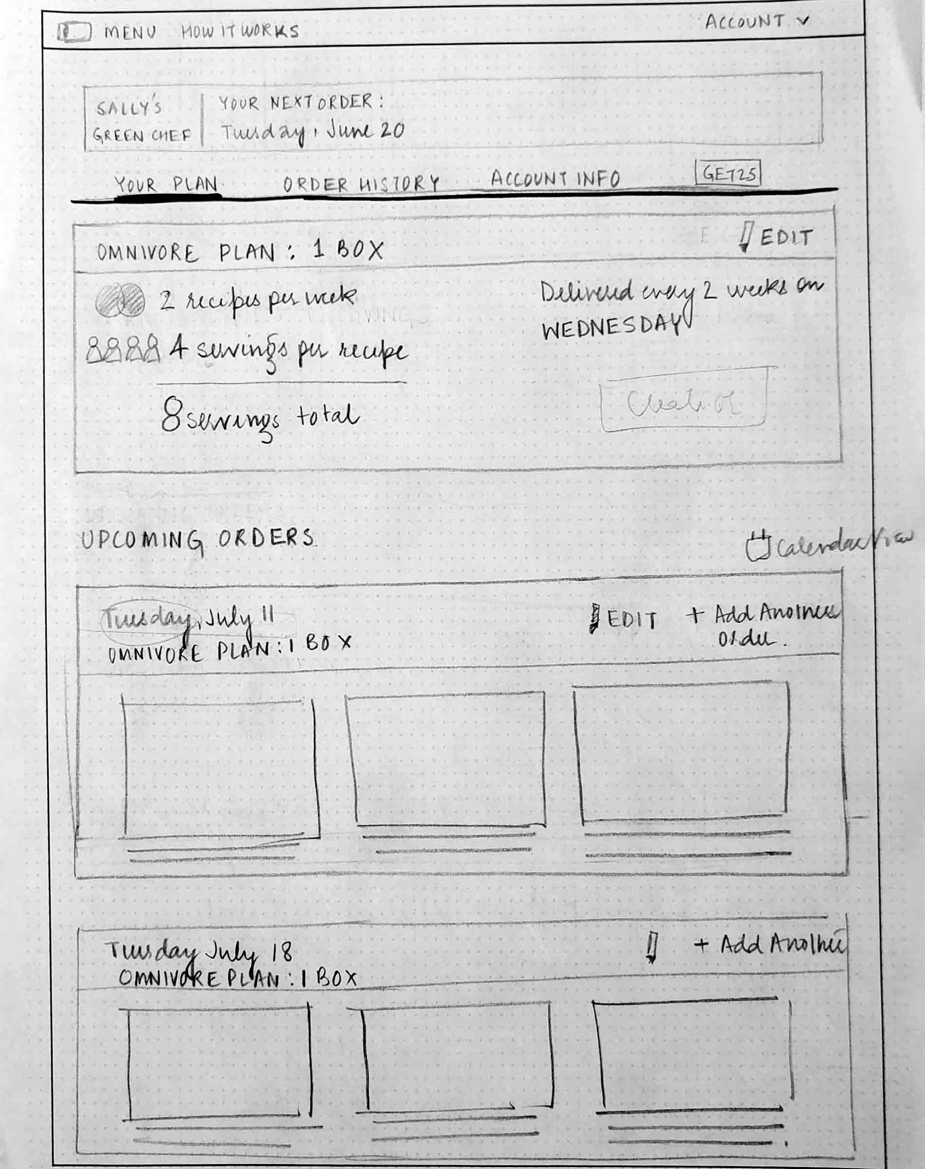
Concept I - Wireframe
Added an 'Edit delivery' option to each week's order. Clicking on Modify will open a modal window with all options to modify the order.
Design for concept I was not much different from the original Account’s page. I maintained the layout showing recipes for upcoming weeks. The design added an ‘Edit delivery’ option to enable one time modifications— menu type, delivery day, address, etc.— instead of skipping order for that week or putting their subscription on hold. Concept I allowed for weekly modifications, but all actions carried equal weight.
The 80 / 20 rule
User research showed that 80% of the time the desired flexibility was the same— to change the menu.
The option to modify the menu being the primary use case, I explored ways to make it more discoverable.
I pulled it out of the "Modify" flow and tried to create a "Browse" experience where users can scan through a list of other menus that week.

Concept II - Wireframe
Concept II creates a separate page for each week's order. In addition to viewing the recipes in your Upcoming order, this new layout has a new "Check out other menus" feed below. These alternate menus being available on the first page makes it easily discoverable instead of hiding it two clicks deep in an edit delivery flow. This makes it easy for users to discover other menus options in case they do not like recipes for their Upcoming order.
Upcoming order
Order something else
Modify order
Skip order
View your upcoming meals this week

.png)
.png)


Users can see recipes for their upcoming orders up to five weeks ahead; giving users plenty of time to manage their deliveries in advance. Users can do one-time modifications to a single order without having to modify their entire subscription.
Linear calendar view
The linear calendar using tabbed UI works as a clear navigation to access and quickly jump to any upcoming week.
A user can see the status overview (scheduled/skipped) for each week without having to click on each one of them.


Standard calendar view
The standard calendar view existed in the old UI, something users actively used. This provides an alternate view for users who prefer the more traditional month view to manage their deliveries.
Modify Order
The popup lets users make one time modifications to their Upcoming order. Users can modify their delivery day, address, serving size, menu or number of boxes ordered for that week.


Skip Order
The action allows users to skip meals for that week. Users see a popup with an option to skip order or get a different menu in case they did not like their meals. It surfaces alternate menus for those who didn’t explore them on the previous page.


Green Chef has a range of meal plans to offer, but users never get a chance to see them easily. This discovery experience highlights the plethora of choice available at Green Chef.
Users can try a taste of something different by effortlessly switching to another meal plan for a single order without changing all future deliveries under their recurring subscription. Scrolling down to Order Something Else section allows users to see suggested menus and swap their current menu for a week.
Green Chef’s digital experience has primarily been a desktop first experience, owing to the higher engagement on desktop than mobile based on quantitative and qualitative data.
I started designing and creating the UX for desktop. Once we had a clear vision of the solution, I translated the flows to mobile web based on a responsive mobile strategy.
.png)


Being a startup, we did not have the luxury of a dedicated researcher on the team, or often the time to run a thorough in-lab usability study.
This was the most significant redesign on the platform since the inception of the service. I convinced the team about the importance of testing such a critical redesign with our users and was able to approve a study with 9 participants.
I don the hat of a researcher and created a research plan with my design lead and ran sessions with 9 participants by inviting them to the office. We gave users tasks around modifying their delivery day, menu, delivery address and skip the order. All the responses were recorded, coded findings and based on the feedback, I iterated on the design and made improvements to the UX.
Since this was the first time we did an in-lab study, we later set up a “Viewing Party” and invited our engineers and PMs to hear what users had to say about the new features we were building.

.png)